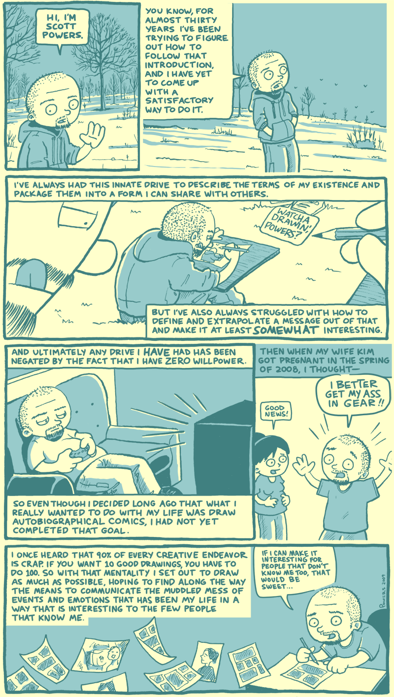
The finished piece. It will certainly do for the first part of an about page. I’ve got more details about this process if you want to read them, but I’ll put them below the art so you can skip the details if you want…
The last real ‘comic’ I drew was probably Midwest Spider-Man. By the time I did that one, I had been doing these strips for almost a year, and I had a process down. That process looked like this:
1. Draw the rough layout in pencil in my sketchbook.
2. Scan the pencil drawing into Photoshop.
3. Take the scanned image and place in Corel Painter.
4. Draw the whole thing in Painter with the Wacom tablet, using layers for the darks and halftones.
5. Lettering was done either with the Wacom tablet or using the webdisaster font I created, depending on how much text there was.
That process was a brutal pain in the ass. It took forever to get a strip done because I could never quite draw my lines the way I wanted with the tablet on the first try. So every single line you see in those strips is probably the 3rd or 50th version of that line I drew. Painful. But still, there was something I liked about it, and I think now that it was zooming in on the line drawings in Painter and coloring in the halftones. Plus I liked the way the final comics came out, so that made it worth it.
But ultimately I knew something had to change, and I started experimenting with doing some other things. In this instance, the process looked like this:
1. Draw the rough layout in pencil in sketchbook.
2. Draw ‘finished’ pencils in sketchbook.
3. Ink on a new sheet of paper using a light table (really a flashlight rigged under my kitchen table) with the pencils underneath.
4. Scan inked drawing into Photoshop.
5. Add letters with Wacom tablet and add shading.
This is the same process I’ve been using for the last few pictures. It’s not really less steps, but those steps are far less painful. The key is that I get to ink with pens instead of the Wacom tablet, and the lettering is still done on the computer where I can undo and move the words around if necessary. I think it comes out looking very organic and with my ‘signature’ style. The biggest time sink is the lettering, but I can see myself getting much faster at it the more I do it. And the only way I’ll get any faster than that is to use a computer font, but I much prefer the hand-lettered look.
I can see using this process over and over, but I’ll probably draw on heavier stock to begin with. I used thin sketch paper and I would have had trouble erasing the pencil lines had I inked on it. Not to mention that I would have ruined the whole thing when I tried unsuccessfully to letter it the other day…


When I was reading about the process, I was wondering if it might be easier to draw and shape lines and curves with vectors rather than trying to trace every line like you’re inking. But that might take away from the “drawerly” style. Disclaimer: I have no idea what I’m talking about in this area.
- by illflux on December 19th, 2009 at 11:35 amYeah, I’ve asked myself that same question. The problem is just as you mentioned, using vector art tends to make lines that are smooth and nice, where I want my lines to be shaky and rougher. Part of what I like about a lot of comic book line art is that texture along the edge of the line, it’s like the artist’s signature. Of course, I’m also saying that because Illustrator frustrates the shit out of me. When I try to draw with vector art I usually end up getting very frustrated trying to do what I want to do. But I guess I can give it a shot again and see how it ends up…
- by webdisaster on December 19th, 2009 at 12:02 pm